Style a component
Style a component in Pattern Dump with a stylesheet of its own, a rule in the base layer and CSS design tokens in your themes, then switch themes in the workbench.
The badge renders, but unstyled. Its styles go in three places: a stylesheet of its own, the base layer beneath every preview, and the themes that give its custom properties their values.
The component's stylesheet
Styles live in a tree of their own, src/styles/, that mirrors src/patterns/. Create src/styles/atoms/badge.scss:
@use "../base/tokens";

.badge {
  display: inline-block;
  padding: tokens.$space-xs tokens.$space-sm;
  background: var(--color-primary, #0b5cad);
  color: var(--color-on-primary, #ffffff);
}

.badge-warning {
  background: var(--color-warning, #8a4600);
  color: var(--color-on-warning, #ffffff);
}
A stylesheet belongs to the component at the same path, .scss left out: atoms/badge.scss styles atoms/badge. A file named like its folder counts as the folder, so atoms/badge/badge.scss would style atoms/badge as well. Numbers in front of folders and files don't have to match between the two trees. An exact path wins, and otherwise the numbers are ignored on both sides, so 00-atoms/badge.scss or atoms/01-badge.scss styles atoms/badge. A file that matches two components that way belongs to neither, and its rules go into the base layer.
Every .scss file under src/styles/ whose name doesn't start with _ is compiled, unless styles.entry in the config names the files to compile.
@use "../base/tokens" loads the starter's spacing values from src/styles/base/_tokens.scss. Sass tries a relative path like this one first. A bare name loads an installed package, found in the node_modules folders from the compiled stylesheet's folder upward, and pkg:@scope/pkg loads one through Sass's Node package importer.
The colours are custom properties, which the themes set further down. Each var() has a fallback, as in the starter's styles, so the badge stays readable where no theme applies: a preview's <body> carries data-theme only when there is a default theme, or a known ?theme= in its address.
Which component owns a class
A class belongs to the rule that defines it: a rule whose selector is the class on its own, such as .badge, .badge:hover or .badge.is-active. A rule that uses it in context, such as .card .badge, only mentions it. When two rules define a class, a component's wins over the base layer's, and otherwise the first one does.
A template that uses a class another component owns, without including that component, borrows it: the owner's stylesheet is linked into the preview too, so the class is styled. The borrowing component's Diagnostics tab says so, as an info that pd audit doesn't repeat, one per owner: <id> uses class "<c>" from <owner>, so <owner>'s stylesheet is linked too: include <owner> if it belongs here, or rename the class. <id> is the borrowing component, <owner> the one that owns <c>, and (and <n> more) follows the class when there are several, where <n> is how many further classes come from that owner.
A rule in the base layer
Some rules belong to no single component: resets, document defaults, @font-face. They go into the base layer, /_pd/base.css, linked first in every preview.
documentBase in the config turns it on, with a list of files and folders relative to src/styles/, or "." for the whole tree. The starter lists base, so every stylesheet in src/styles/base/ is in it. Add a focus outline for every component to src/styles/base/document.scss:
:where(:focus-visible) {
  outline: 0.125rem solid var(--color-primary, #0b5cad);
  outline-offset: 0.125rem;
}
:where() gives the selector no specificity, so a component's own focus style, such as the starter button's, still wins.
A file or folder that documentBase lists is in the base layer even when its path matches a component. An entry that matches no file warns at startup: [dev-server] documentBase "<entry>" matches no stylesheet in <dir>, where <dir> is the styles folder. The base layer is linked when the list isn't empty, or when a pattern package used with its styles lists something in a documentBase of its own.
Rules that no component owns and documentBase doesn't list go into the base layer too. When there are any, pd dev sums them up in one line at startup, which names a report: BASE-LAYER.generated.md, in Pattern Dump's scratch folder, rewritten at every start. It lists each file with its number of such rules, most first.
Theme values
The badge reads --color-warning and --color-on-warning, which no theme sets yet.
A theme is a file in the themes folder, ./themes in the starter, named <name>.theme.scss. Its name is the file's name without .theme.scss, and folders inside the themes folder are not read. The starter's two themes set their values on [data-theme="light"] and [data-theme="dark"]. Add the badge's two to each, in themes/light.theme.scss:
[data-theme="light"] {
  color-scheme: light;
  --color-surface: #ffffff;
  --color-text: #1b1b1f;
  --color-text-muted: #4b5563;
  --color-primary: #0b5cad;
  --color-on-primary: #ffffff;
  --color-border: #6b7280;
  --color-warning: #8a4600;
  --color-on-warning: #ffffff;
}
and in themes/dark.theme.scss:
[data-theme="dark"] {
  color-scheme: dark;
  --color-surface: #16181d;
  --color-text: #eceef2;
  --color-text-muted: #b4bac4;
  --color-primary: #7ab8ff;
  --color-on-primary: #0b1220;
  --color-border: #9aa1ad;
  --color-warning: #ffb45c;
  --color-on-warning: #1f1300;
}
Give every theme the same properties, named as your component styles read them. A property that a theme leaves out has no value while that theme applies, and the var() falls back.
The starter switches themes by attribute (themes.switch: "attribute"): every theme's stylesheet is linked into a preview, and the theme picker sets data-theme on the preview's <body>. Values set on [data-theme="<name>"], exactly that selector, are also where the picker reads its swatches. The other switch, "stylesheet", links only the active theme, and the themes reference covers both.
A theme is compiled with Sass, like any stylesheet, so it can @use a module by a relative path, or an installed package by its name or a pkg: address. Its CSS is served at /_pd/themes/<name>.css.
While pd dev runs, an edit to a theme compiles it again and refreshes the open preview, with [dev-server] Theme CSS updated: <name> in the terminal. These are the problems a theme can have:
- A theme that fails to compile at startup
[dev-server] Theme compile error (<name>):, followed by the error. The theme is served empty.- A theme that fails to compile after an edit
SCSS error: <error>in the workbench, as a build error, where<error>is the compiler's message. The theme keeps the last CSS that compiled.- A default that matches no theme
[dev-server] themes.default "<name>" matches no theme; available: <a, b>, at startup, where<a, b>are the themes it found, in alphabetical order.themes.defaultnames the theme a preview starts with.
What a preview links
Every preview is a document of its own, with its stylesheets linked in this order: the base layer, the stylesheets that assets.css in the config names, the themes, then the component's CSS. Later rules win where specificity is equal, so the badge's own rules come after the base layer and the theme values.
Switch themes
Open the badge's warning variant in the workbench and switch between light and dark in the theme picker. The badge takes each theme's values, and the swatches show each theme's --color-surface, --color-primary and --color-text.
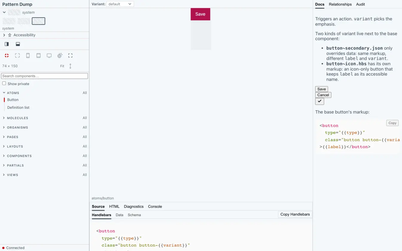
Your styled component
The badge has a stylesheet, the base layer has a focus outline, and both themes carry the badge's colours. The next step checks your work: the Diagnostics tab and pd audit.