Add a component
Add a component to your style guide: a Handlebars template with its data, its component documentation and a schema, then give it a variant.
A style guide grows one component at a time. In Pattern Dump, a component is a Handlebars template in a folder of its own, and the files beside it give it data, documentation and a schema.
This step adds a badge to the starter: a short label such as "New", with a variant for a warning.
The template
Create a folder for the badge under src/patterns/atoms/, and its template in it, badge.hbs:
<span class="badge badge-{{tone}}">{{label}}</span>
Every .hbs file in a folder under src/patterns/ is a component, however deep it sits. A file directly in src/patterns/, with no folder of its own, is not read, and neither is a file or folder whose name starts with a dot.
A component has two names, both from its path:
- The slash id
- The path below
src/patterns/without.hbs. A file named like its folder takes the folder's slash id, soatoms/badge/badge.hbsisatoms/badge. A number in front of a folder or file (00-atoms) stays in the slash id. - The handle
- The first folder and the component's name, joined by
-:atoms-badge. Folders in between are left out, and so are numbers in front (00-,01_). Templates include each other by handle.
Two components in the same patterns folder with the same handle collide: the first by sorted path keeps it, and the other is left out of the tree. The Console shows the error Handle collision: "<h>" is held by <incumbentPath>; <quarantinedPath> is quarantined until one is renamed, where <h> is the handle, <incumbentPath> the component that keeps it and <quarantinedPath> the one left out, and pd audit lists it as a defect.
In the workbench, the badge sits under Atoms in the Nav Rail, titled badge until its docs give it a title.
Its data
Beside the template, badge.json holds the data it renders with:
{
  "label": "New",
  "tone": "info"
}
Files belong to a component when they share its name exactly: badge.json for data, badge.md for docs, badge.schema.json for the schema.
A component renders with global data first, when the config names a data folder, then its own .json, then a variant's .json, and last any data passed to the render. Objects merge key by key, and anything else, arrays included, is replaced.
A data file that isn't valid JSON is an error, <file> is not valid JSON (<reason>); its data was not used, with the line and column. <file> is the file's name, <reason> what the parser found.
Its documentation
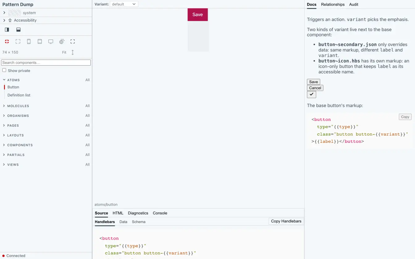
badge.md is the component's documentation. The Inspector's Docs tab shows it:
---
title: Badge
description: A short label beside a title or an item.
status: draft
---

A short label. `tone` picks its colours: `info` or `warning`.

```pattern atoms/badge~warning
```

```src-data atoms/badge~warning
```
The block between the two --- lines holds the metadata, and only that block is read: a line such as title: x in the text, or in a file without the block, is text. A quoted value loses its quotes, and a key with an empty value counts as not set.
title- The name in the Nav Rail and the Inspector. Without it, the file's name:
badge. description- One line, shown with the component.
statusdraft,stableordeprecated. Any other value, or none, isdraft.deprecated-use- One line: what to use instead of a deprecated component.
visibilitypublicorprivate. A private component is marked private in the tree and left out of folder galleries.
The block can also hold order, preview, requireScript and requireAssets, for the order in the tree, how the Stage frames the component, and the behaviour scripts and SVG symbol sets it loads.
Live examples and source
A fenced block whose language is one of these is replaced when the docs render. The component's slash id goes on the fence line, or on the first line inside the block:
pattern <id>- The component itself, rendered into the docs.
~<variant>after the slash id shows a variant. A slash id that names no component or variant, or a render that fails, shows[pattern: <spec> · render error], where<spec>is what you wrote. src-template <id>- The template, highlighted as Handlebars. Always the base component's: a
~<variant>is ignored. A component made of variants alone, or an unknown slash id, shows[src-template: <spec> · no template file]. src-data <id>- The component's
.jsonas written, or[src-data: <spec> · no data file]without one. For a variant, the base's data and the variant's merged, global data left out, and[src-data: <spec> · unknown variant]when there is no such variant. src-html <id>- The rendered HTML, escaped and highlighted. A render that fails shows
[src-html: <spec> · render error].
On a site page, a pattern block shows the component in a frame of its own, and a missing component there fails the build. A later step, writing a page for the site, covers it.
Its schema
badge.schema.json is a JSON Schema for the badge's data:
{
  "type": "object",
  "required": ["label", "tone"],
  "properties": {
    "label": { "type": "string" },
    "tone": { "type": "string" }
  }
}
Pattern Dump checks the merged data against it on every render, and only at the top level:
- A required field that is missing
- Each name in
requiredwhose value is absent ornullis anUNFILLED_REQUIREDerror:Required field "<key>" is absent in the merged data.<key>is the field's name. - A value of the wrong type
- Each property with a
typethat the value doesn't match is aSHAPE_MISMATCHwarning:Field "<key>" expected <types> but got <type>, where<types>is what the schema allows, joined with|, and<type>the value's type. A list counts asarray, a whole number asintegerandnumber. Nested properties are not checked. - A schema that isn't valid JSON
- A
SCHEMA_INVALIDerror at its line and column:<file> is not valid JSON (<reason>), so <id> isn't checked against its schema until it's fixed. With a site, it also stopspd build.
Every variant is checked against the base component's schema.
A variant
A variant is a file beside the template, named <name>~<variant>. Add badge~warning.json:
{
  "label": "Deprecated",
  "tone": "warning"
}
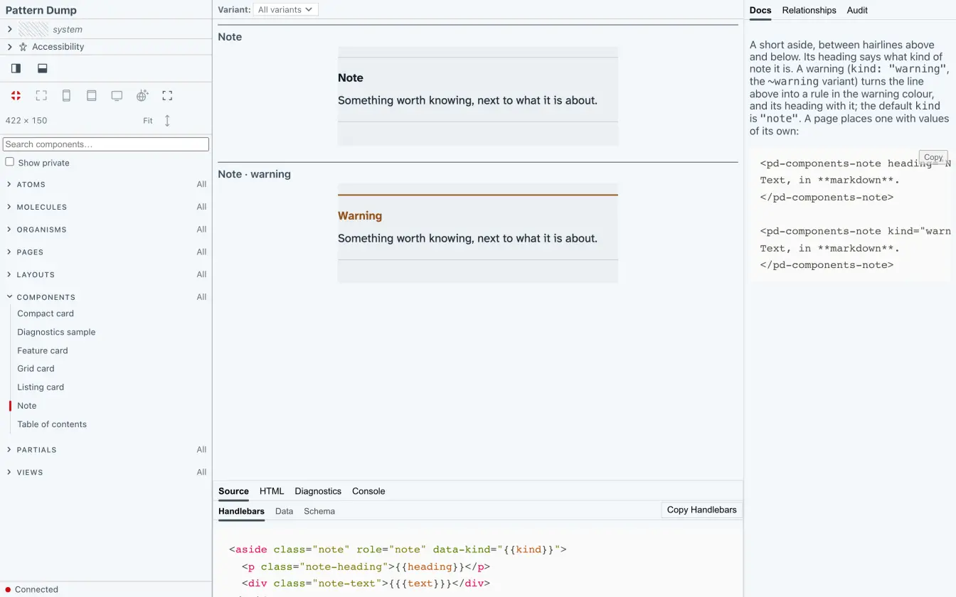
The badge now has a variant, warning: the same template, with this data merged over badge.json. The variant's name is the text between the first ~ and the next one. There are two kinds:
badge~warning.json- A data overlay: the base template with other data, so it needs a
badge.hbsto overlay. Without one, it is left out:pd devnames it in the terminal, and the Console shows the warningWarning: Data variant left out: <variant path> needs <base path> to overlay, and there is none. The two paths are the variant's file and the template it is missing. badge~warning.hbs- Markup of its own. It still gets the base's data, and a
badge~warning.jsonbeside it goes on top.
A component can be made of variants with markup of their own alone, with no badge.hbs. The workbench then shows the variants, and the component itself renders empty.
A variant can have its own .md and .schema.json (badge~warning.md), though the checks still use the base's schema. Without its own .md, it shows the base's documentation, with its own title, description and status: its title is then badge~warning.
Include it in another component
A template includes another component by its handle, with data as arguments:
{{> atoms-badge label="Beta" tone="info" }}
A variant's handle contains ~, so it is quoted:
{{> "atoms-badge~warning" }}
An included component's own .json is only its default. The context it is included in goes over it, and the arguments over that. So a field of the including component with the same name as one of the badge's wins inside the include, even when it isn't passed. A variant included by its handle gets its base's .json beneath its own.
The Inspector's Relationships tab shows every include, in both directions. Pattern Dump reads them from the template as written: a partial that a helper picks while rendering is not one of them.
Your component
The badge is in the Nav Rail, with its docs, its data checked against its schema, and a variant. It has no styles yet: next, style it.