This style guide
How this site's style guide is organised in the Pattern Dump workbench: its folders, the layouts, partials and views of the site, its tokens and base layer, and its three themes.
How this site looks is decided in styleguide/, a pattern package in the same repository. It holds the components, the layouts the pages render with, the tokens and the themes. The style guide runs in a workbench of its own. Its published workbench sits beside this site and shows the components this page describes.
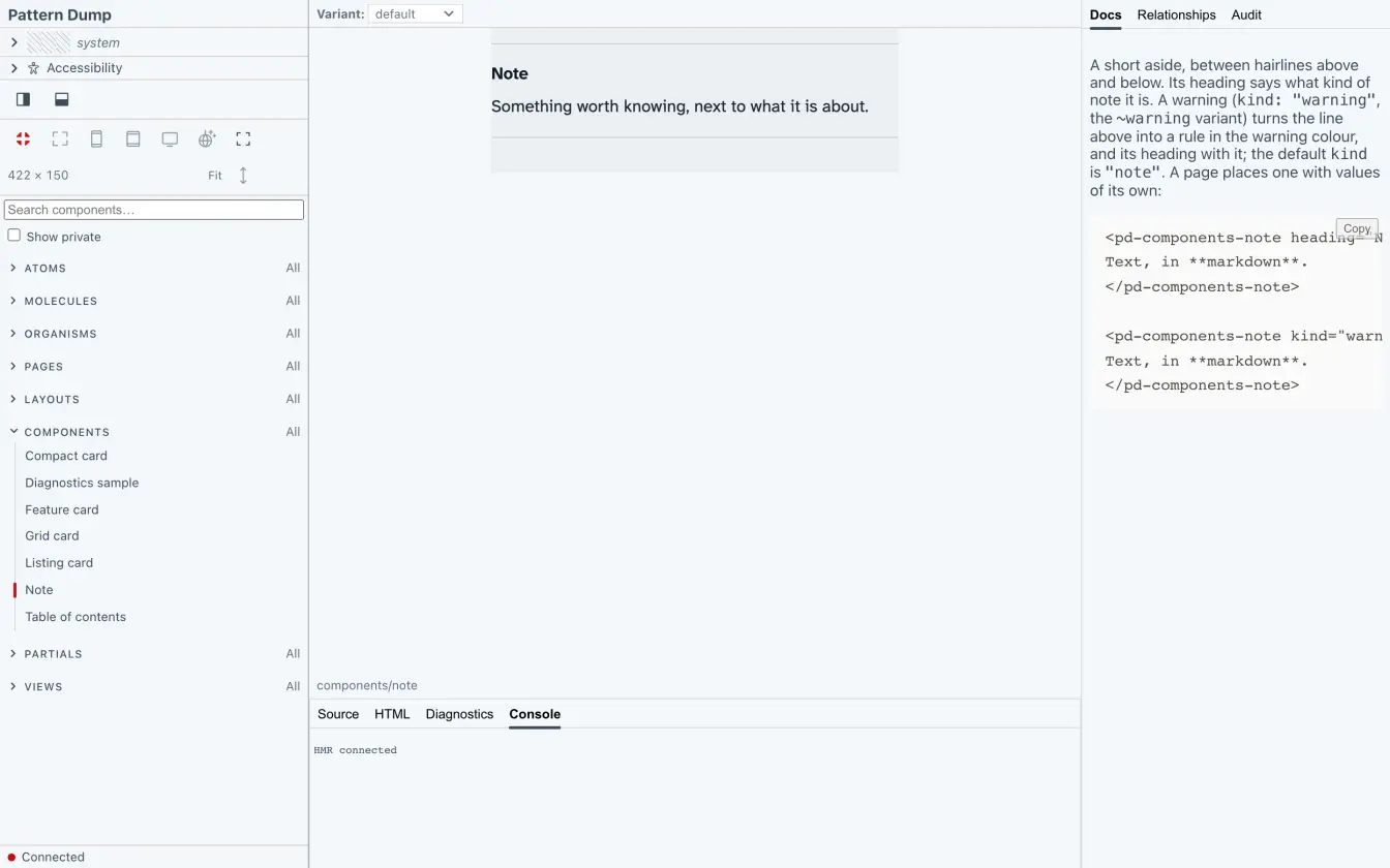
Its own workbench
In styleguide/, npm run dev runs pd dev --port 4300, so the style guide's workbench and the site's pd dev can run side by side. Its config is short, because the folders are named in the patternDump field of its package.json, which the site reads as well:
import { defineConfig } from "pattern-dump";

// The style guide as a project of its own: its own `pd dev` and workbench. Its folders (patterns, styles and the
// base layer, themes, scripts, assets) are described once, in package.json's "patternDump" field, which both this
// workbench and the site (../site, which installs this package) read.
export default defineConfig({
  outDir: "./dist",
  styles: { strategy: "parallel" },
  assets: { strategy: "central" },

  // Pattern packages used alongside this project's own patterns: install them, then name them here.
  // packages: ["@n8d/htwoo-patterns"],

  shell: {
    brand: { title: "Pattern Dump" },
  },
});
The folders in the Nav Rail
src/patterns/index.md orders the top-level folders:
---
order: [atoms, molecules, organisms, pages, layouts, ...]
---
... stands for every folder the list doesn't name. Here those are components, partials and views, which follow in alphabetical order. The Nav Rail shows eight folders: Atoms, Molecules, Organisms, Pages, Layouts, Components, Partials and Views.
Five of the folders have an index.md of their own, with a title, how their components are previewed, and a line or two of text:
atoms,moleculespreview: centered: a component renders in the middle of the Stage and takes the room it needs.organisms,pages,layoutspreview: full: a component fills the Stage, as the site's header, footer and whole pages do.
components, partials and views have none. Their titles come from the folder names, and their components are previewed centred.
The search field in Molecules owns a component, its input, so it has an arrow in the tree. The input is private: it shows only with Show private ticked.
The text of a folder's index.md shows above its gallery, the page that lists every public component in the folder:
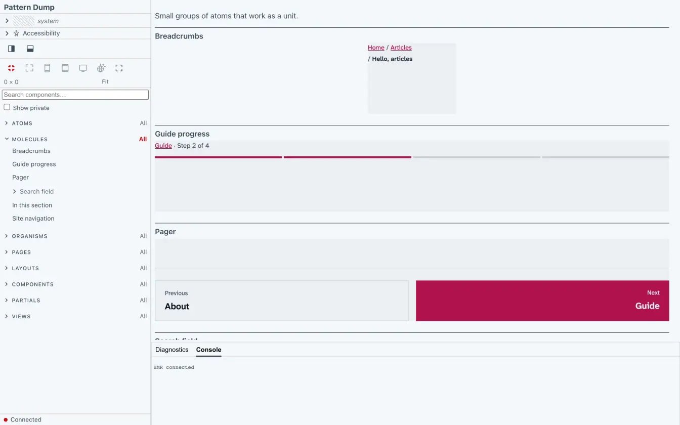
The site's layouts, partials and views
The site's pages render with components from three folders:
layouts/- One component per layout a page can name in its frontmatter:
article,categories,category,doc,home,listing,page,tagandtags. Each fillspages/frame, the site's frame, so it previews as a whole page. partials/base, whose schema declares whatsite.globalsmay hold, andhead, what the style guide adds to every page's<head>. The frame around every layout ispages/frame.views/- How a listing shows its pages:
compact,featured,gridandlist.
They are components like any other: the workbench previews them, and pd audit checks them.
Tokens and the base layer
The base layer is src/styles/base/, named in documentBase. Its stylesheets belong to no component. Pattern Dump links them first in every preview, and on every page of the site before the stylesheets of the layout and its components:
_tokens.scss- Sass values every stylesheet can
@use: the spacing steps, the font stacks, the font weights with the mixin the themes use, and the measures of the header and footer bars. It writes no CSS of its own. colors.scss- Every colour the style guide and the site use, each with a light and a dark value, written once as custom properties such as
--color-text. document.scss,typography.scss,fonts.scss,page.scss,reading.scss- The document itself: the reset, the type, the self-hosted fonts, the page, and the reading page of the doc and article layouts.
code-block.scss,definition-list.scss,doc-example.scss,doc-image.scss- Markup that comes from markdown or from Pattern Dump, not from a component: code blocks, definition lists, live examples and symbol images, the diagrams.
A component's own styles sit at the same path under src/styles/ as its template under src/patterns/: src/styles/molecules/pager.scss for molecules/pager.
Three themes
themes/ holds light.theme.scss, dark.theme.scss and system.theme.scss, and system is the default. The colours don't change from theme to theme: they are in colors.scss, with a light and a dark value each. A theme sets color-scheme, and with it which of the two values shows:
[data-theme="system"] {
  color-scheme: light dark;
}
system follows the reader's setting, as the site does. light and dark fix one scheme, to check a component in each. They also fix the font weights, lighter in dark, which system leaves to the dark-mode query in typography.scss. The style guide switches themes by attribute, so every theme's stylesheet is linked into a preview, and the theme picker sets data-theme on the preview's <body>.
The theme picker shows a theme's swatches from the custom properties its [data-theme] rule sets. Without themes.swatch in the config, it looks for --bodyBackground, --themePrimary and --accent, and these themes set none of them, so their swatches show no colour.
How the site installs this package and publishes its workbench is on This site.